
How do I use Color Schemes for Interior Design? | The Artisen
An advanced crash-course on color for practical use.
The human eye can distinguish about 10 million colours. From the moment we wake up, we are interacting with hundreds and thousands of shades each instant - and each moment we receive thousands of visual cues about our environment.
From that favourite cup of coffee - to picking out an outfit for work, we are unconsciously interacting with colours and making colour decisions. Even so, we probably don’t fully recognize the power of colour over our moods and emotions.
To understand how colour can affect our lives and improve our surroundings, let’s look at the basics of colour first. Colour can be better understood by examining the colour wheel, colour harmonies and by viewing colour in context.
The human eye can distinguish seven colour spaces, that are VIBGYOR (or ROYGBIV!). This is often depicted using a colour wheel. Colours that sit diametrically opposite to one another are called “Complementary colours” - such as green and red - and those that represent lighter and darker shades of the same colour come together to form a monochromatic colour palette.
Why do some colours look better in space than others? While people have their own preferences regarding colour, very often it’s the combination of two colours that creates an overall mood or effect on perception. When selecting two colours that work well together, you are trying to achieve a colour harmony. There are four predefined colour harmonies that can be used as tools to better inform us when we make colour decisions for our homes.

Cool Colors Dominance Harmony
This harmony represents all the colours of the colour wheel that sit next to the colour blue - right up to a cool shade or red and a cool shade of green.

Warm Colors Dominance harmony
Similarly, this harmony represents all the colours of the colour wheel that sit next to the colour red - right up to a warm orange or red and a warm green.

When using the above harmonies - don’t feel like you can’t use pops of the opposite dominance - as long as the overall effect remains warm or cool as per your choosing.
Compound Harmonies
Compound harmonies can be used with great effectiveness to create interesting decor for any space - as this uses opposite ends of the colour wheel in a triad to form interesting colour combinations. For example, when pairing yellow - you can choose the diametrically opposing colours of purple and blue to offset the warmth and radiance of a bright yellow.

Be careful that the saturation of each colour - that is the percentage of grey present in the colour - matches overall - thus, choose either bright colours or muted colours to create triads. This will prevent your compound harmony from looking dull or mismatched.
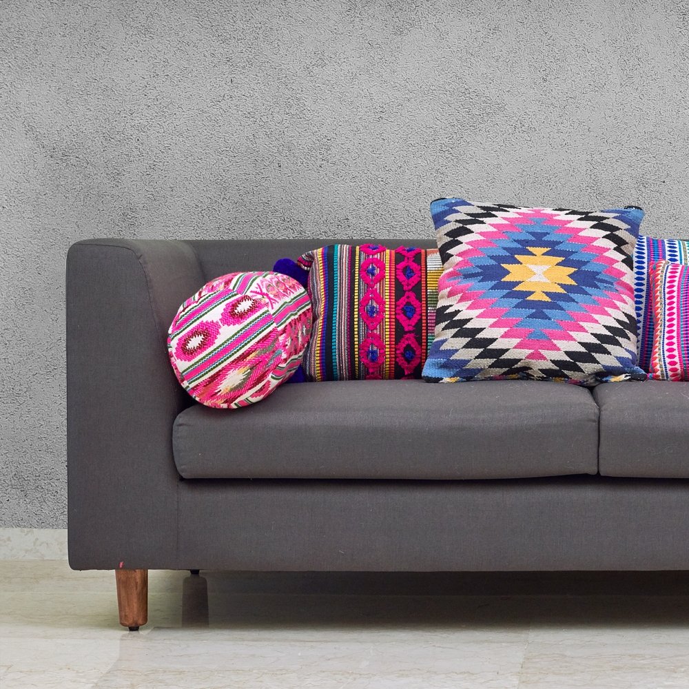
Tetradic & Square Colour Harmony
When you want to mix things up - nothing takes decorating to the next level as using lots and lots of well-chosen colour. You can do this by choosing four colours in total - two that sit closer to the colour wheel - for example, yellow and red - and the other two that sit diametrically opposite - such as green and blue. Let one of the four colours dominate - for example, if you have a bright yellow couch, let the smaller cushions be red, green and blue.

Similarly, the ‘square’ colour harmony can be used when you choose colours that are further apart - such as orange, purple, green and blue. However, be extremely careful when pairing these colours together as they can easily overwhelm.
Notes on Colour for Spaces
Have you ever wondered why bright green walls aren’t a household staple? Most homes will use shades of white, or pastels to adorn their walls. This is because colour in vast amounts - particularly very bright colour, can be overwhelming to the senses. Bright walls and interesting upholstery can really bring a space together - there are trade secrets that help achieve these fascinating harmonies. We'll talk more about using colour harmonies and spaces in our next blog post.
Read more
Texture in Interior Design | The Artisen
Colors dominate the conversations of interior design while textures come as an afterthought even though textures add subtle or prominent dimensions to a room through their visual and tactile cues. ...
Read more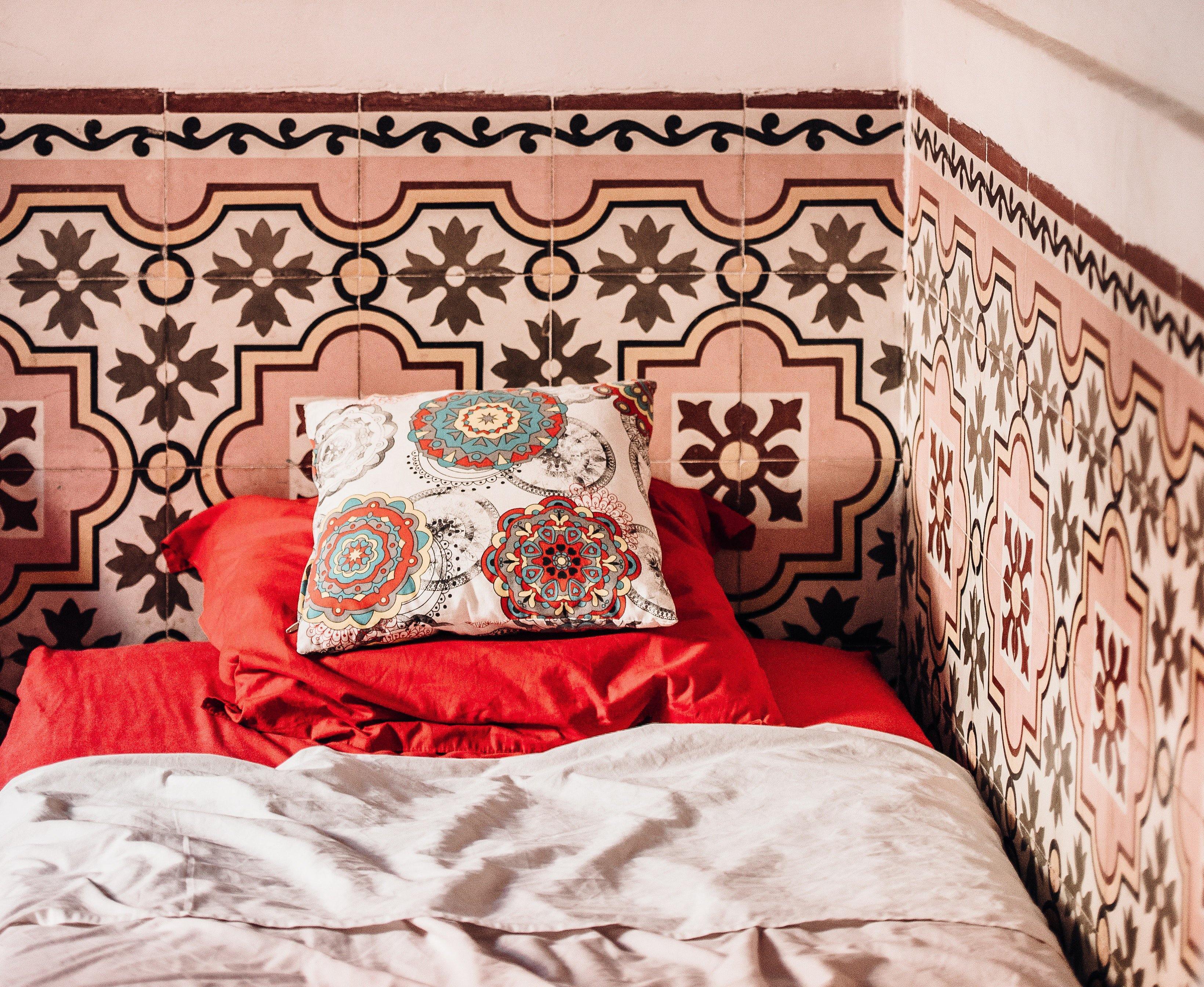
Bohemian Abode: 6 Unique Ways To Make Your Beautiful Boho Bedroom | The Artisen
Boho décor is the best way to add earthy colors, lots of texture, and vibrant vibes to your bedroom with a focus on decor elements. You can use lamps, plants, sculptures, pillows, throws, cushions,...
Read more